Website modernization · Vet-Ray
Modernizing a website so the right customer finds the right next step.
Vet-Ray sells veterinary imaging equipment: big, considered purchases with lots of options. I redesigned and rebuilt the website around one question every visitor brings: what is right for my practice, and how do I ask about it?
- Client
- Vet-Ray by Sedecal
- My role
- UX, design, and build
- Focus
- Discovery to quote request
- Built with
- Lovable, AI-assisted development
The challenge
A lot to choose from, and no clear place to start.
A practice owner shopping for imaging equipment is busy and usually between appointments. They face dozens of systems, technical terms, and two very different reasons to visit: buying something new or getting help with something they already own.
Sound familiar? Many small businesses have the same problem. The offer is good, but visitors have to work too hard to find what fits and to ask for it.
The approach
Start with the visitor's next decision.
I organized the experience around equipment discovery, a clearer quote request, and a separate path for existing-customer support.
The solution · Small things, big impact
Six details that make the next step easier.
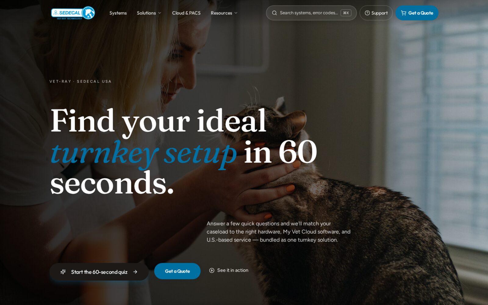
- Plain promise. The headline says what you get and how long it takes.
- Two paths. Start the quiz if you are exploring, or get a quote if you know.
- Always reachable. Search, Support, and Get a Quote stay in the header on every page.
A friendly starting point for people who are not sure yet.
The small thing
The first screen offers a 60-second quiz alongside the quote button, instead of only a menu of product names.
What it can do for a business
Not every visitor is ready to buy. Giving unsure visitors an easy first step keeps them on your site instead of sending them to a competitor or back to search.
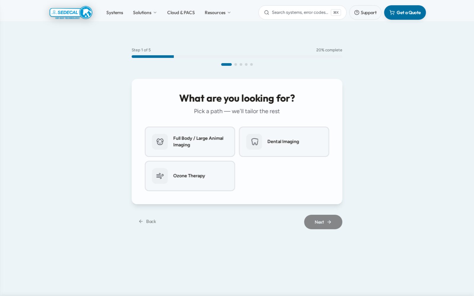
- Progress shown. Step 1 of 5 and a progress bar set expectations.
- Few choices. Three clear options instead of a long list.
Questions in the customer's words, one at a time.
The small thing
The quiz asks what you are looking for in everyday terms, with a progress bar showing how far along you are.
What it can do for a business
Short, visible steps feel manageable. A guided set of questions can help a visitor arrive at a conversation already knowing what they need, which makes the first call easier for both sides.
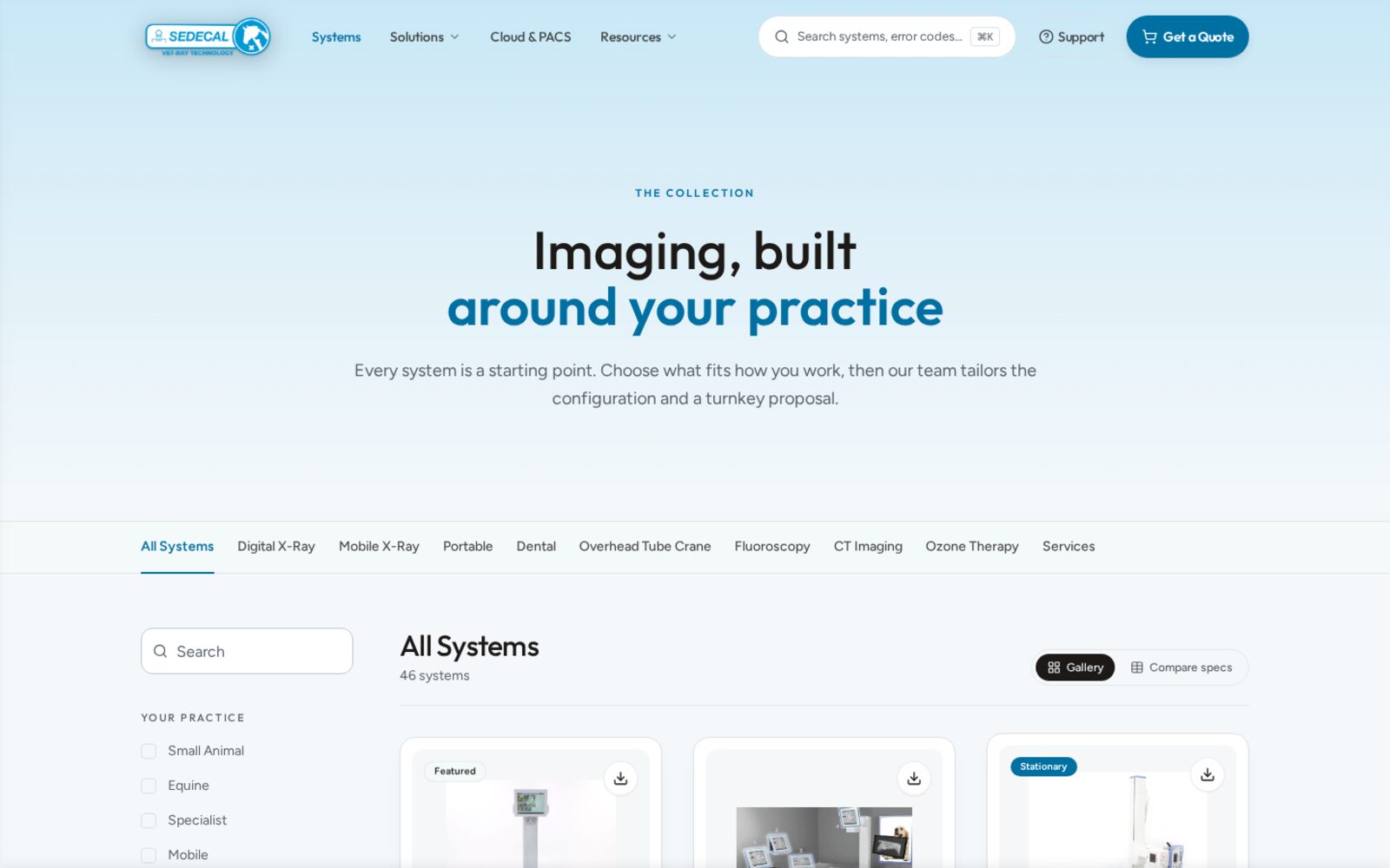
- Category tabs. Digital, mobile, dental, and more, one tap away.
- Practice filters. Small animal, equine, or specialist.
- Compare specs. Side-by-side details without leaving the page.
Browse by how you work, then compare side by side.
The small thing
Systems are grouped by type and filtered by practice, with a switch between a gallery and a spec comparison.
What it can do for a business
When people can compare options on the page, they spend less time downloading brochures or emailing basic questions. Inquiries can start further along.
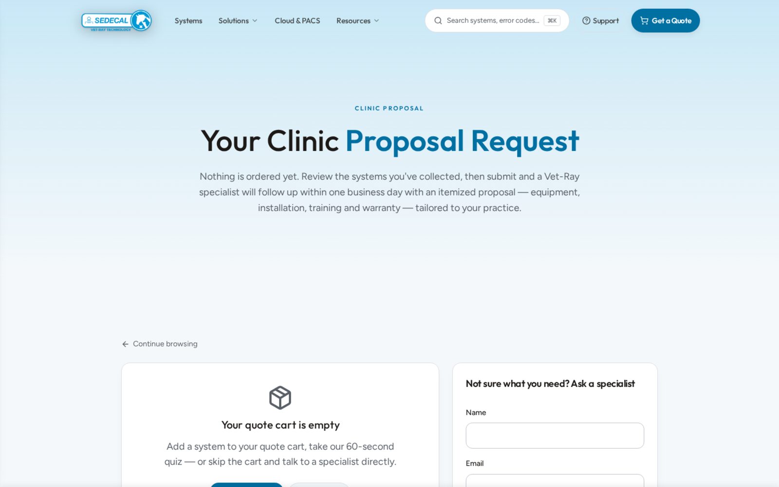
- Reassurance first. Nothing is ordered yet. Review, then submit.
- Clear follow-up. The page explains what the proposal will include.
- Not sure?. A short Ask a specialist form for undecided visitors.
A quote request that explains what happens next.
The small thing
The request page says nothing is ordered yet and describes the follow-up, and a short form is there for anyone who is unsure.
What it can do for a business
People hesitate when they do not know what a button will do. Saying exactly what happens after they ask lowers the pressure, and gives undecided visitors a way to reach a person.
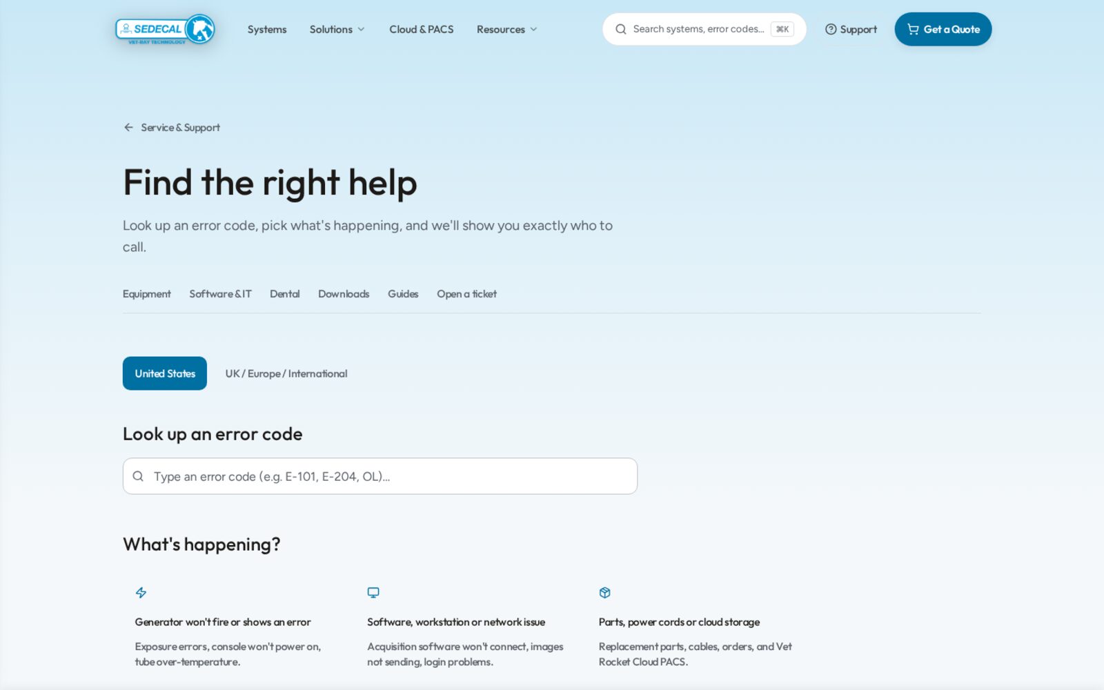
- Error code lookup. Type the code you see on the machine.
- What's happening?. Plain options instead of a phone list.
Help for existing customers, kept separate from sales.
The small thing
Support starts with an error code lookup and a few plain choices that point people to the right contact.
What it can do for a business
Existing customers find help faster, and their urgent questions do not get mixed in with new sales inquiries. Both groups get a better experience.
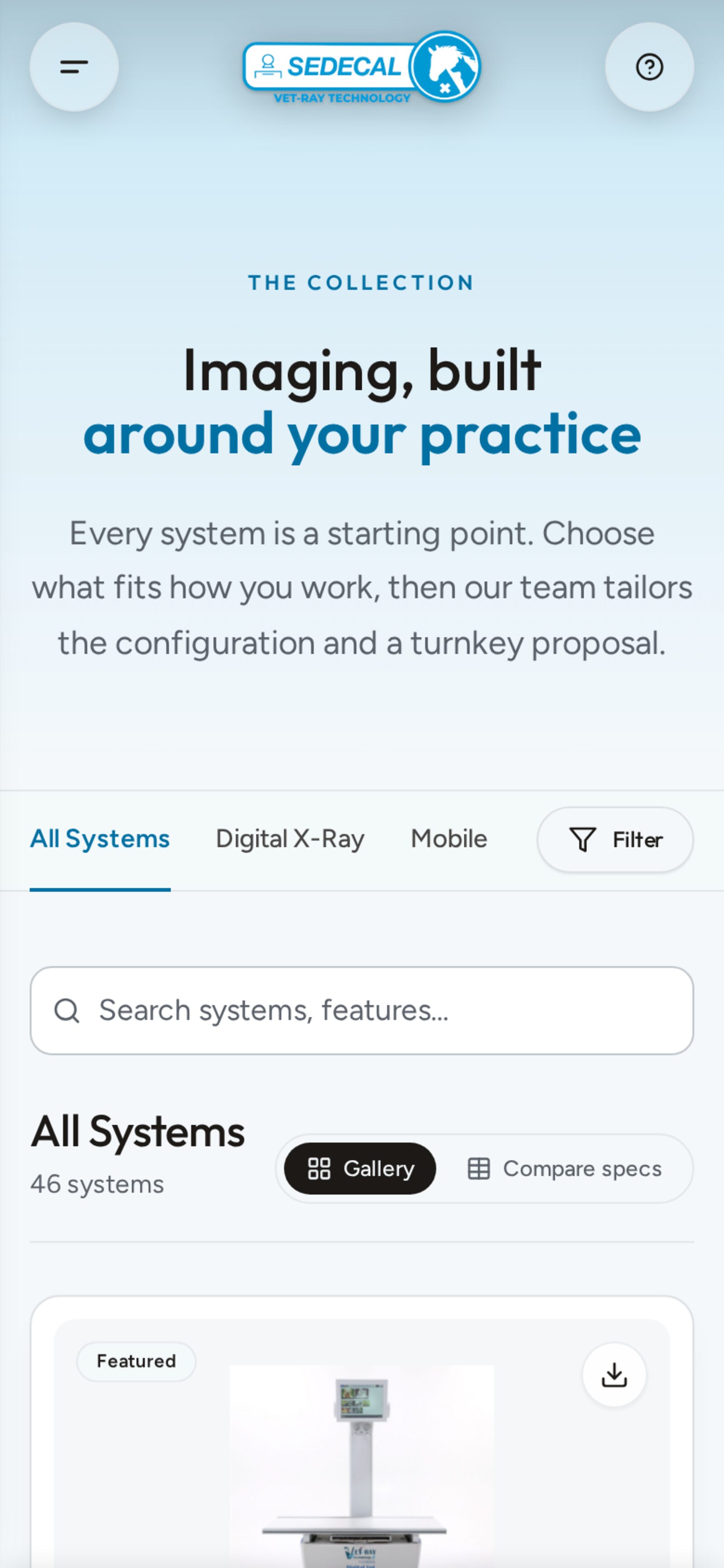
- One Filter button. Options stay out of the way until needed.
- Readable sizes. Text and buttons sized for touch.
Works just as well on a phone.
The small thing
On small screens, filters fold into a single Filter button and search sits right where your thumb is.
What it can do for a business
Many owners research on their phones between tasks. A site that is easy to use on mobile means they can keep going instead of saving it for later and forgetting.
The outcome
A clearer experience, with results still to measure.
This case study describes the design and features I built. It does not claim measured changes in traffic, inquiries, or sales. Screens are from the live site at the time of writing.
The separate trade-show banner engagement had production and delivery pending at review; those outcomes are not claimed here.
Try this on your own site
Lessons for any small business.
Give unsure visitors a first step.
A short quiz, a checklist, or a simple question form can catch people who are not ready to buy.
Say what happens after they click.
One sentence about the next step can make asking feel safe.
Separate buying from getting help.
New customers and existing customers need different doors.
Check it on a phone.
If it is hard to use with one thumb, many visitors will not finish.
This case study describes the design and features I built. It does not claim measured changes in traffic, inquiries, or sales. Screens are from the live site at the time of writing.
What could feel easier for your customers?
Let’s find the small things on your site.
A UX & Workflow Assessment starts at $650 and gives you a prioritized starting point.
Let's talk about your project