Online shop for a small farm · Lily Row Farm
Giving a small farm a shop that works as hard as they do.
Lily Row Farm is a Wisconsin perennial nursery run by Jessie and Dale. I designed and built their website around the two things visitors come for: finding the right plants for their garden, and planning a visit to the farm.
- Client
- Lily Row Farm
- My role
- UX, design, and build
- Focus
- Online shop and visit planning
- Built with
- Lovable, AI-assisted development
The challenge
A big collection, and visitors with very different plans.
The farm grows hundreds of perennial varieties. Some visitors know exactly what they want; others are choosing by color, height, or when it blooms. And many are not shopping at all: they want to know when the farm is open and how to get there.
Most small businesses share this challenge. Your website has to serve the ready buyer, the careful browser, and the person who just wants your hours, all at once.
The approach
Start with the visitor's next decision.
I organized the website around choosing plants and planning a visit, with different paths for browsing and more focused searches.
The solution · Small things, big impact
Four details that help a small farm sell and welcome visitors.
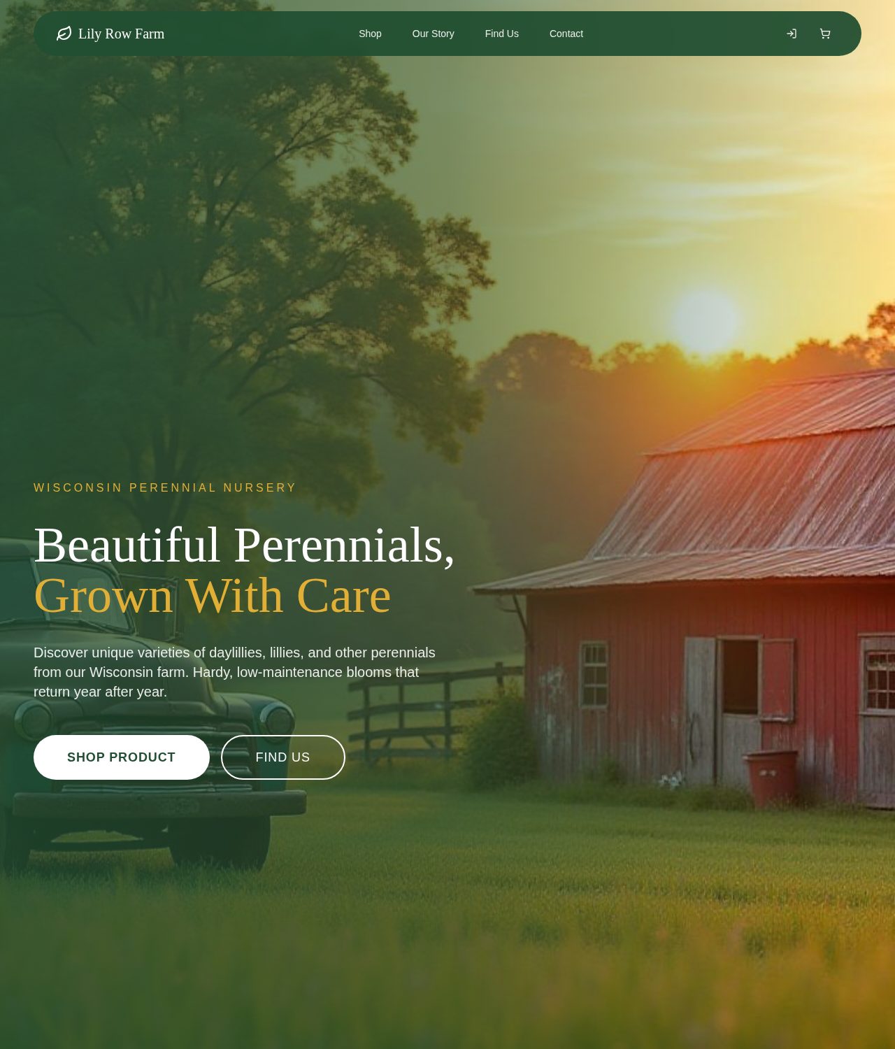
- Plain promise. What the farm grows and why it is easy to keep.
- Two paths. Shop online, or plan a visit.
- Simple menu. Shop, Our Story, Find Us, Contact. Nothing extra.
A first screen that says what the farm offers.
The small thing
The opening screen promises hardy, low-maintenance perennials from a Wisconsin farm, with two clear buttons: Shop Product and Find Us.
What it can do for a business
Visitors decide in seconds whether a site is for them. Naming what you sell and where you are, with a button for each kind of visitor, keeps people from bouncing back to search.
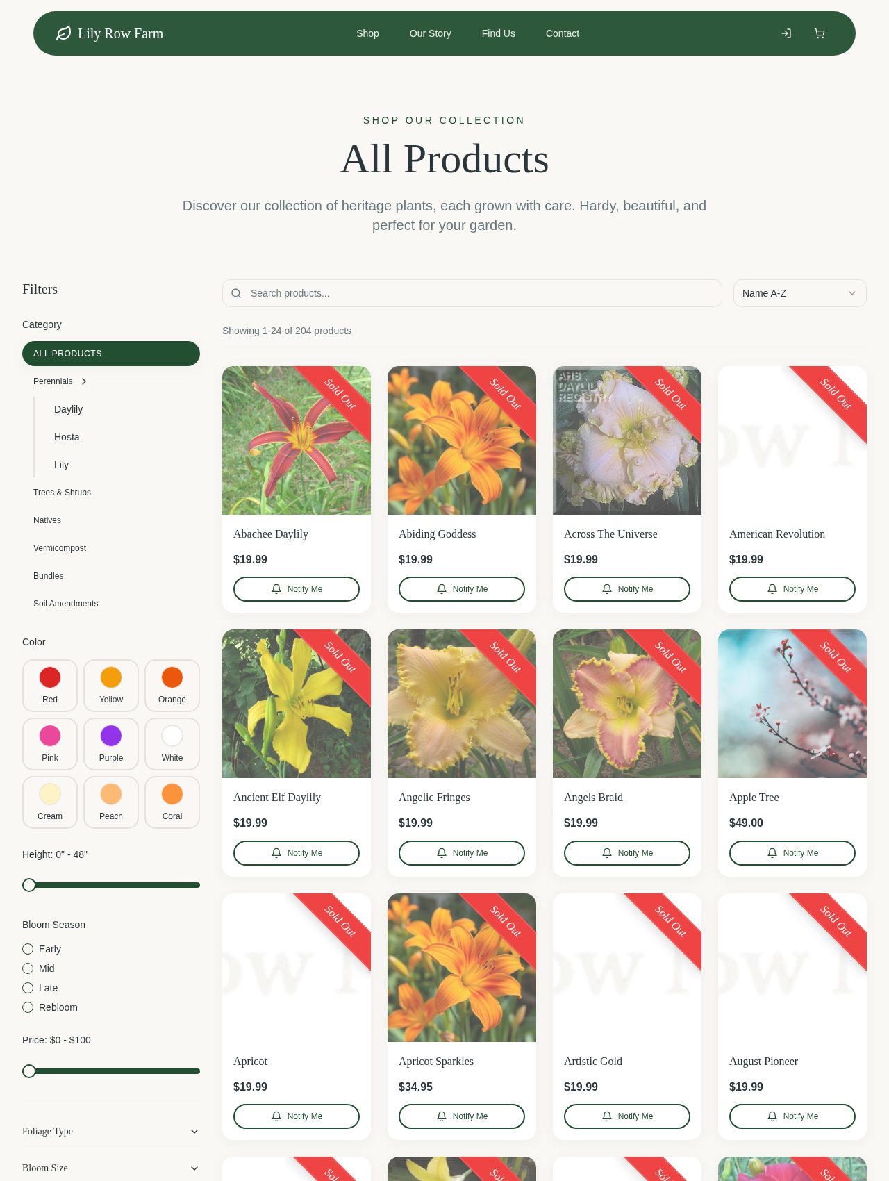
- Color swatches. Pick a color instead of reading descriptions.
- Bloom season. Early, mid, late, or rebloom, in plain words.
- Search for experts. Collectors can jump straight to a variety.
Filters that speak a gardener's language.
The small thing
The shop lets people narrow 200-plus plants by color, height, bloom season, and price, with a search box for those who know the variety name.
What it can do for a business
A long product list can overwhelm. When people can filter by what they actually care about, a big catalog feels like a curated one, and they are more likely to find something to buy.
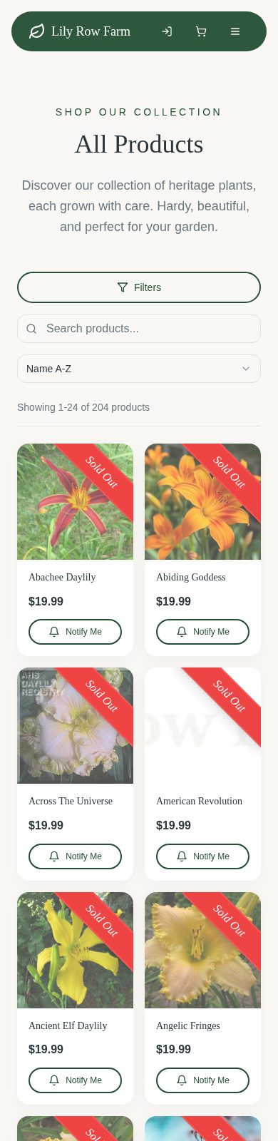
- Honest labels. Sold Out is clear, not hidden until checkout.
- A way back. Notify Me keeps the relationship going.
- Demand signal. Requests show what to grow more of.
Sold out does not have to mean goodbye.
The small thing
Sold-out plants show a Notify Me button, so a disappointed visitor can leave their email and come back when the plant is ready.
What it can do for a business
Seasonal businesses sell out. A notify-me option turns a dead end into a future sale, and tells the farm which varieties people want most.
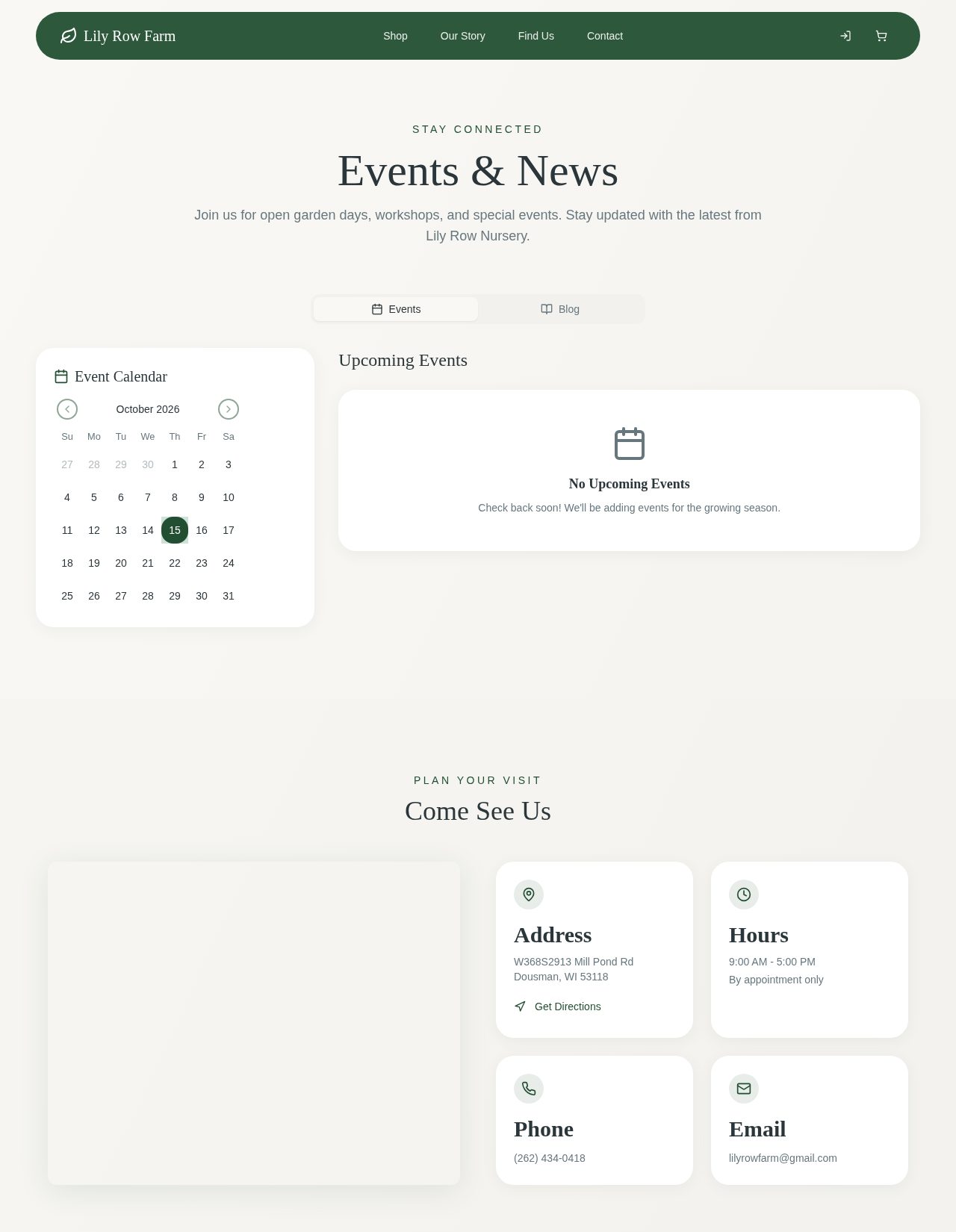
- Get Directions. One tap opens the route in a maps app.
- Hours up front. By appointment only, stated plainly.
- Events calendar. Open garden days give people a reason to come.
Planning a visit without a phone call.
The small thing
The Find Us page puts the address, hours, phone, and email in separate cards, with a Get Directions link and an events calendar for open garden days.
What it can do for a business
Every question your website answers is an interruption you avoid. Clear visit details mean fewer phone calls and more confident visitors arriving at the right time.
The outcome
A clearer experience, with results still to measure.
This case study describes the design and features I built. It does not claim measured changes in traffic, sales, or visits. Screens were captured from an isolated copy of the actual project at the time of writing.
Try this on your own site
Ideas to borrow for your own shop or studio.
Serve the browser and the buyer.
Filters and search let each visitor shop the way they think.
Turn dead ends into follow-ups.
A notify-me or waitlist option keeps interest alive when stock runs out.
Answer the practical questions.
Hours, directions, and contact details deserve a prominent place.
Keep the menu small.
A few clear choices beat a long list of pages.
This case study describes the design and features I built. It does not claim measured changes in traffic, sales, or visits. Screens were captured from an isolated copy of the actual project at the time of writing.
What could feel easier for your customers?
Let’s make your shop easier to browse.
Whether you sell plants, products, or your own time, we can make finding and buying feel simpler.
Let's talk about your project