Brand site for a garden product · Worm Poo For You
Turning an unusual product into a story people understand.
Worm Poo For You sells premium worm castings through its family farm partner, Lily Row Farm. I designed and built the brand site to explain what worm castings are, who they help, and how to use them — then hand off to the farm shop to buy.
- Client
- Worm Poo For You
- My role
- UX, design, and build
- Focus
- Brand story to farm-shop handoff
- Built with
- Lovable, AI-assisted development
The challenge
An unfamiliar product, and buyers who are new to it.
Worm castings are black gold to gardeners — and a mystery to everyone else. The site has to do real teaching before it can sell: what the product is, why it beats synthetic fertilizer, and how to actually use it.
And the brand does not run its own store. The site must build enough confidence for visitors to click through and buy at the partner farm's shop, without the safety net of a checkout nearby.
The approach
Start with the visitor's next decision.
I organized the site as an explanation that builds to a handoff: what the product is, why it helps, who it is for, how to start, and where to buy.
The solution · Small things, big impact
Four details that turn curiosity into a purchase.
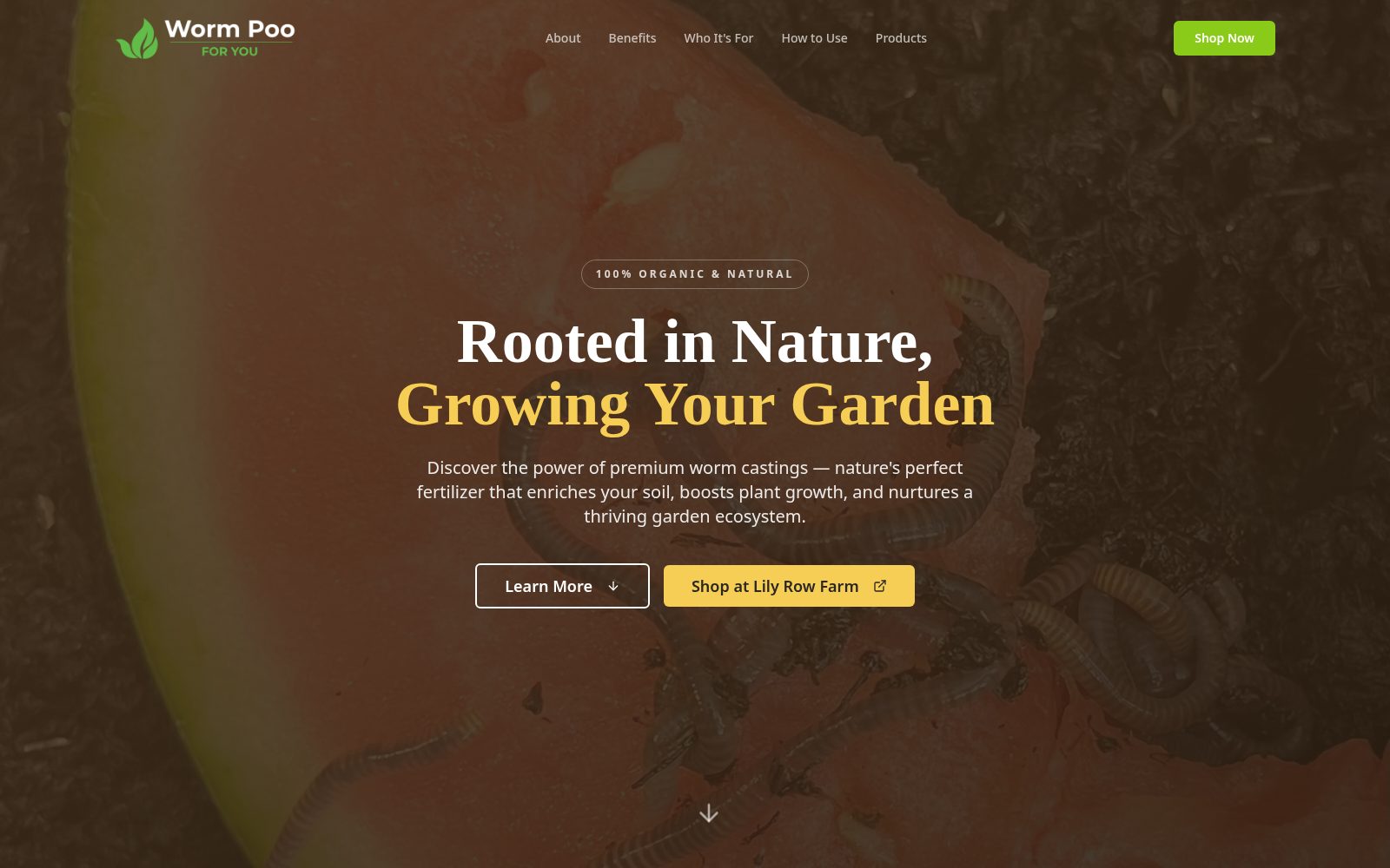
- One clear promise. What the product does, in words a gardener would use.
- Two paths. Learn more for the curious, shop for the ready.
- 100% Organic badge. The claim that matters most, up front.
A first screen with warmth and a way in.
The small thing
A full-bleed garden photo sits under the headline Rooted in Nature, Growing Your Garden, with two buttons: one to learn more, one to shop at Lily Row Farm.
What it can do for a business
An unusual product needs a first impression that feels natural rather than niche. A warm hero that offers both paths — learning and buying — serves the curious visitor and the ready one at the same time.
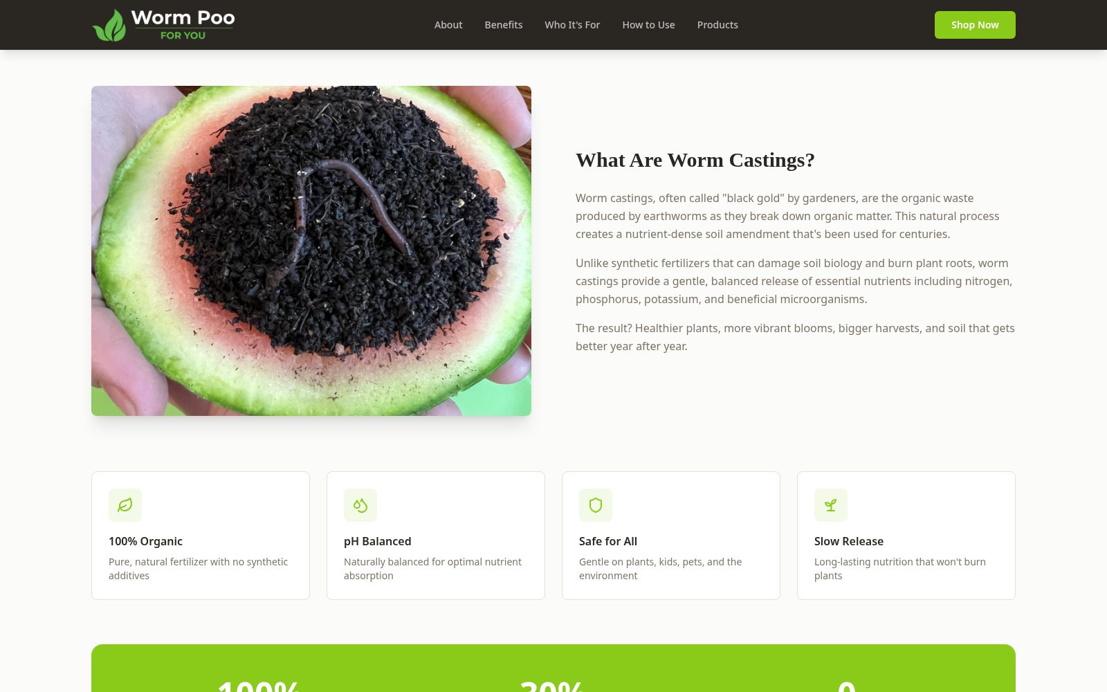
- Everyday words. The explanation avoids jargon and explains the process.
- Benefits as cards. Four scannable reasons instead of a dense paragraph.
Answering the question in the visitor's head.
The small thing
A plain-language What Are Worm Castings? section explains the product beside a friendly photo, followed by four benefit cards: 100% organic, pH balanced, safe for all, slow release.
What it can do for a business
Nobody buys what they do not understand. Teaching first respects the visitor and gives them reasons to trust the product, which is what makes the later shop link work.
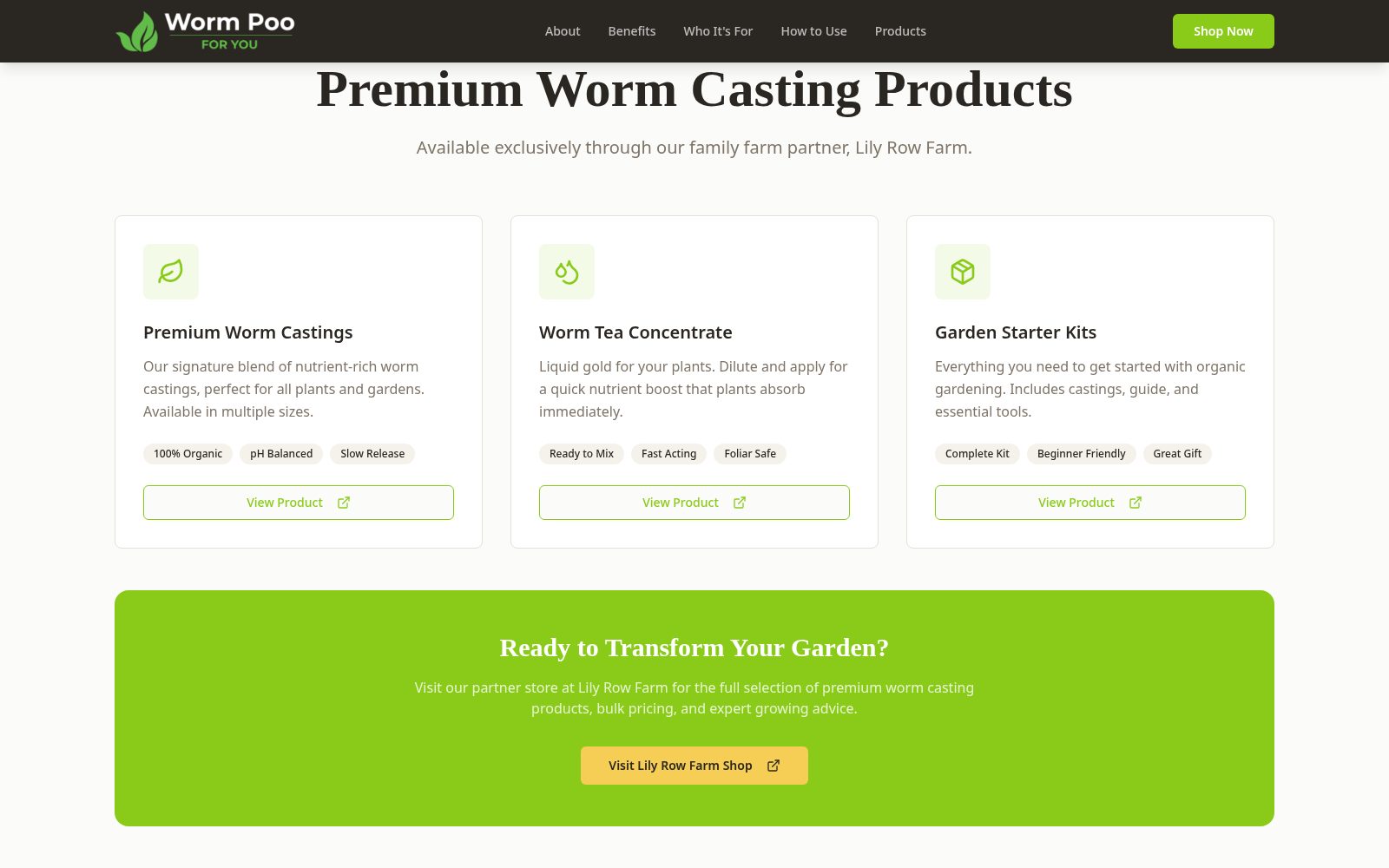
- Partner named. Lily Row Farm is credited as the place to buy, clearly.
- Every card closes. Each product ends in its own way to the shop.
- Closing invitation. One last call to visit the shop before the page ends.
Products that end in a clear next step.
The small thing
Each product card — worm castings, worm tea concentrate, garden starter kits — ends in a View Product button that leads to the partner shop, reinforced by a Ready to Transform Your Garden call to visit Lily Row Farm.
What it can do for a business
A brand site that sells elsewhere has to make the handoff feel deliberate, not like a dead end. Clear, repeated buttons keep momentum from the story to the shopping cart.
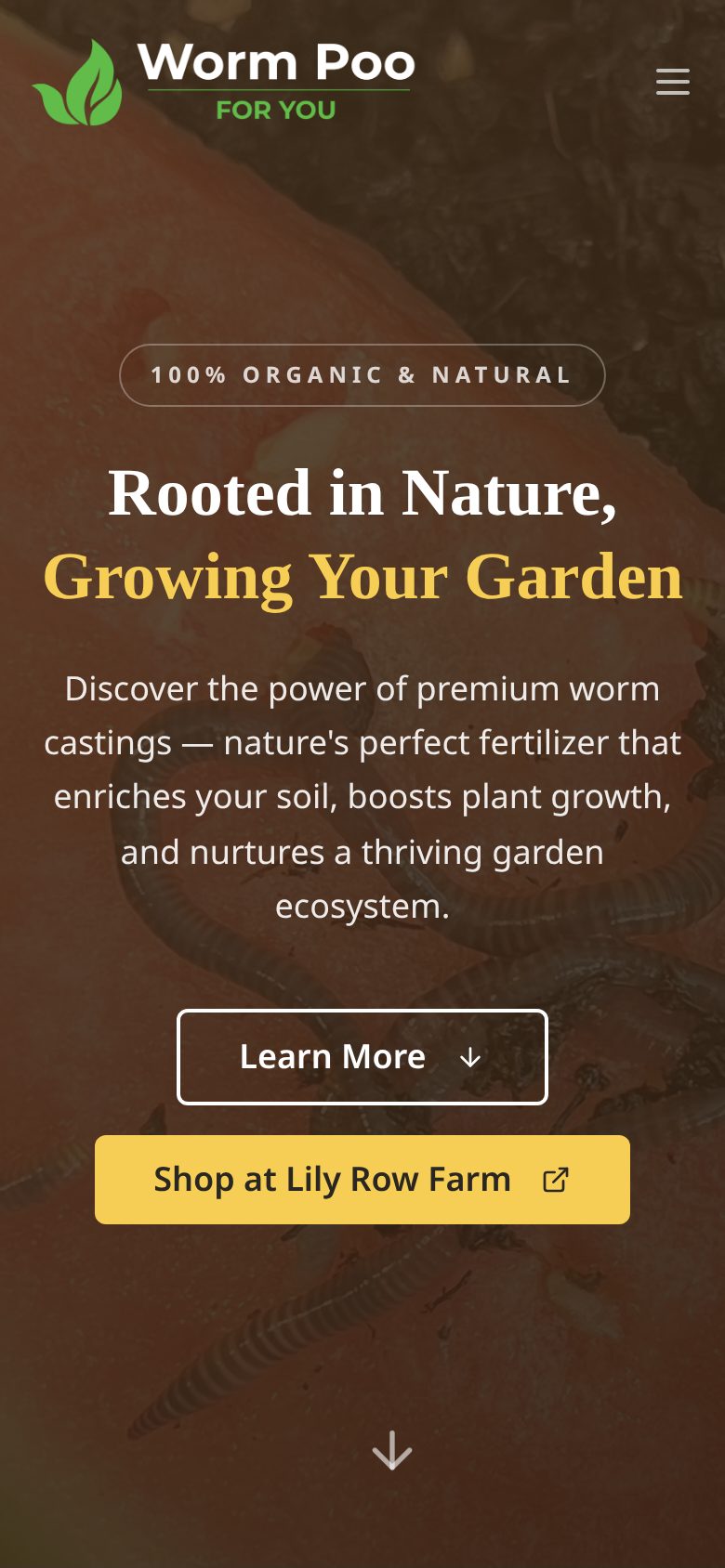
- Readable headline. Large type that survives a small screen.
- Buttons in order. Learn first, then shop, stacked for one thumb.
A hero that works at thumb height.
The small thing
On a phone, the headline and the two buttons stack in a comfortable order, with the shop button standing out in the brand's warm accent.
What it can do for a business
Gardeners research on phones between beds and pots, and often away from a desk. A hero that reads and works one-handed keeps the visit alive until they are ready to buy.
The outcome
A clearer experience, with results still to measure.
This case study describes the design and features I built. It does not claim measured changes in traffic, sales, or shop visits. Screens were captured from an isolated copy of the actual project at the time of writing.
Try this on your own site
Ideas to borrow for your own product story.
Teach before you sell.
An unfamiliar product earns its sale by explaining itself first.
Meet people where they are.
Sections for different kinds of gardeners let each reader see themselves.
Make the handoff obvious.
When you sell through a partner, send every product clearly to the place that can complete the sale.
Keep the first screen simple.
One promise and two paths beat a busy opening.
This case study describes the design and features I built. It does not claim measured changes in traffic, sales, or shop visits. Screens were captured from an isolated copy of the actual project at the time of writing.
What could feel easier for your customers?
Let’s tell your product’s story plainly.
Whether your product is familiar or one-of-a-kind, we can make its value easy to understand and easy to buy.
Let's talk about your project