The Objective
Show Insights
Improve data visualization and reporting to help podcasters track their performance and audience engagement.

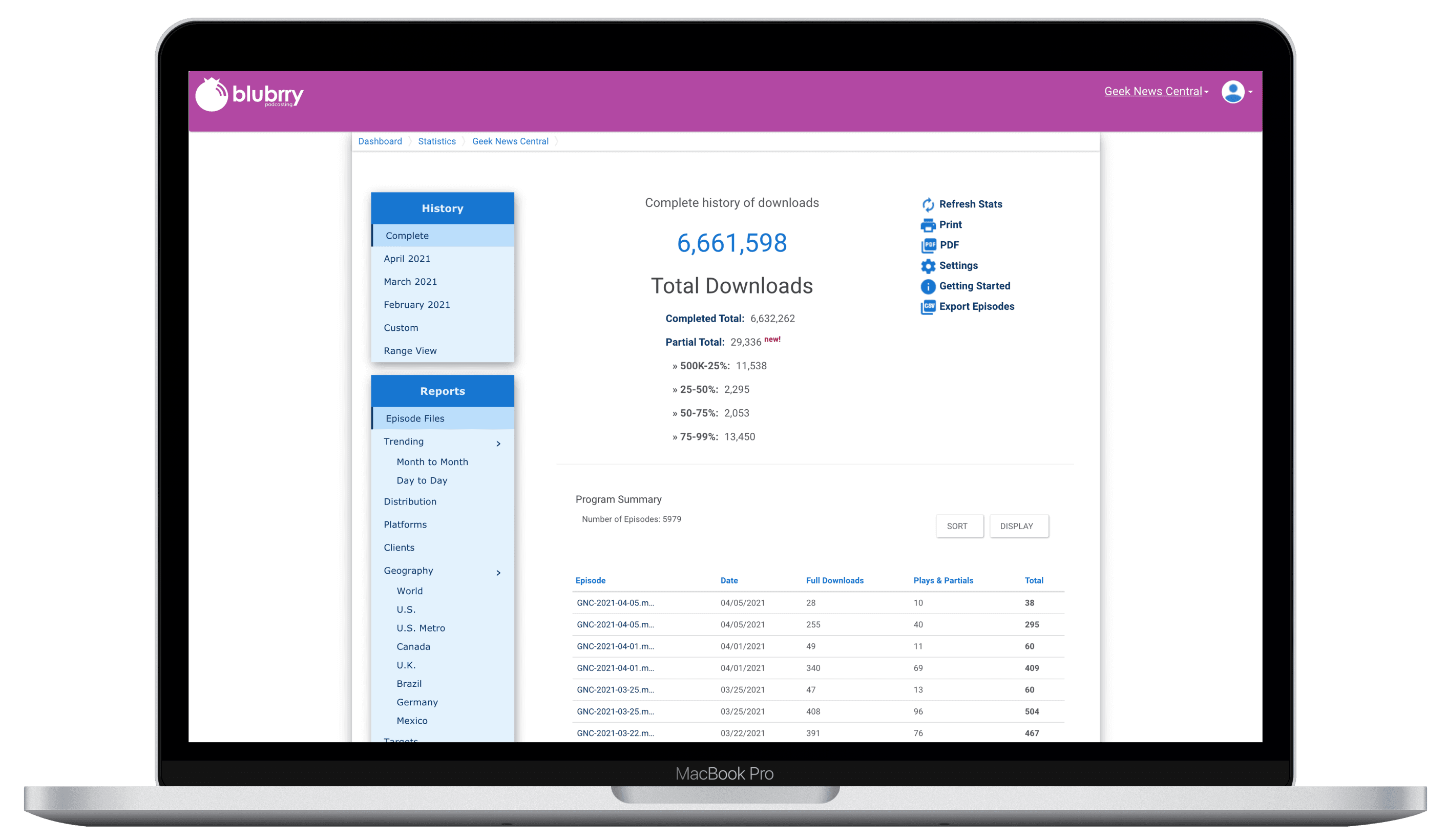
Before
Minimal charts and static data views.
Difficult to filter or drill down into specific metrics.
Outdated design that did not leverage visual hierarchy.
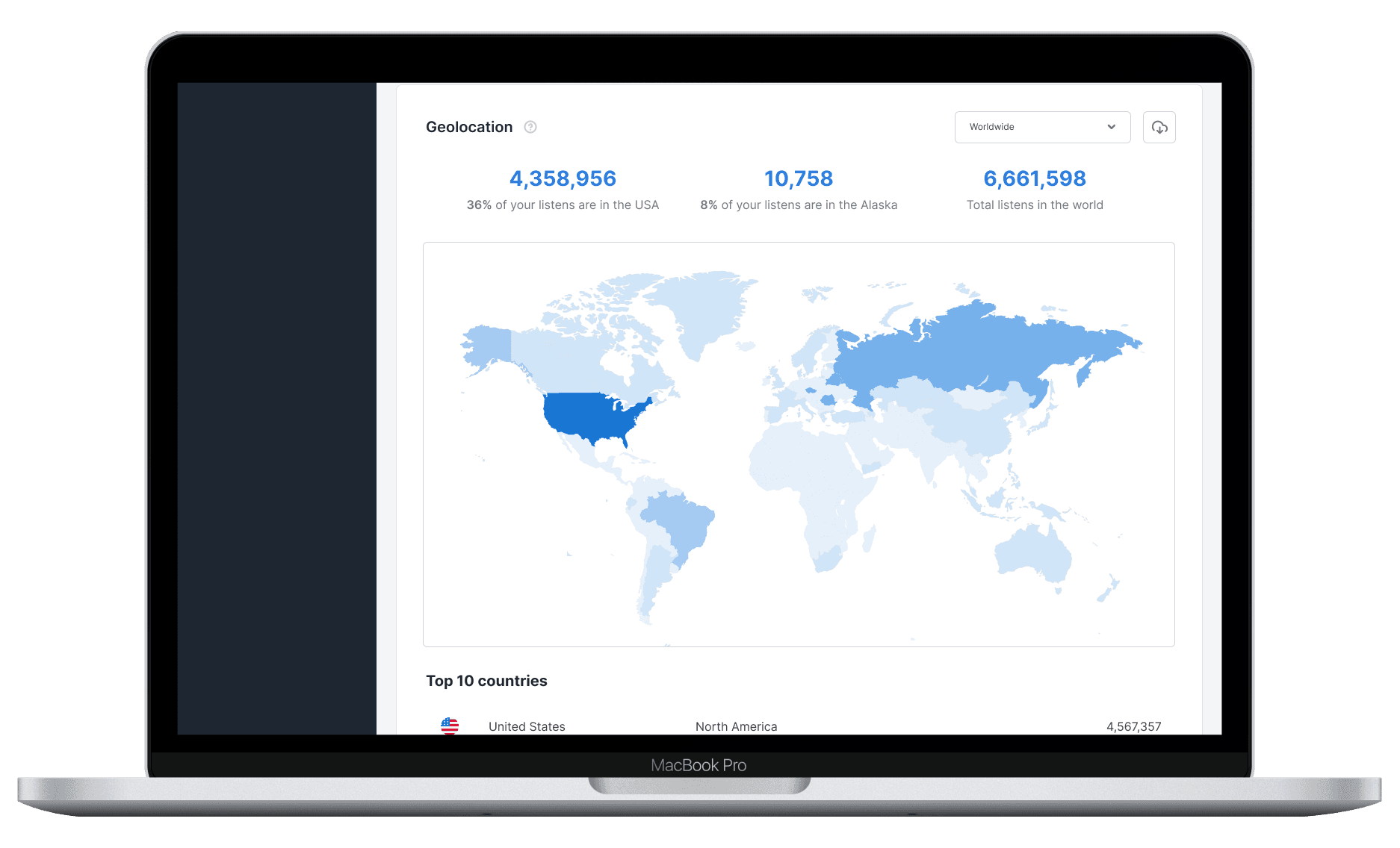
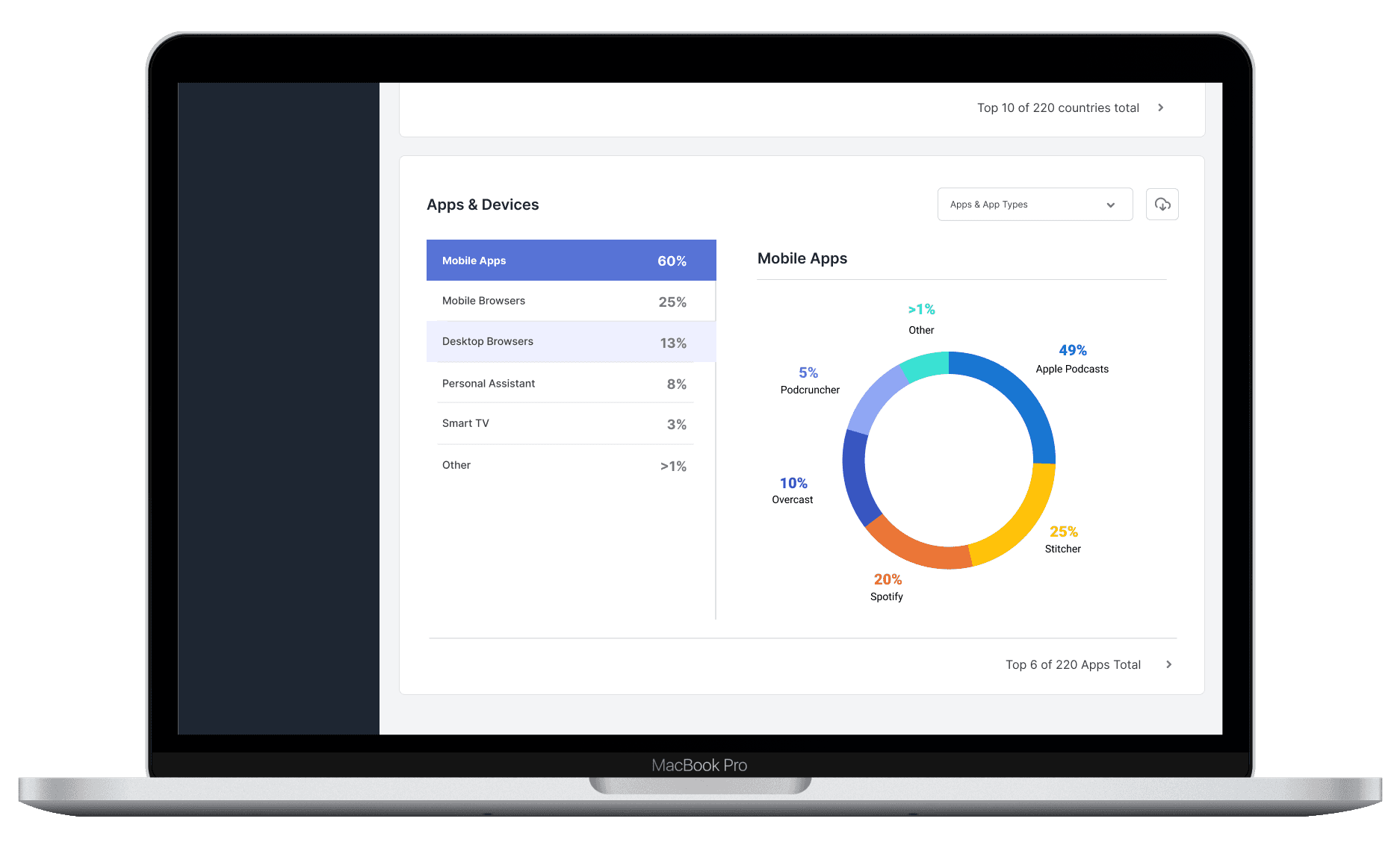
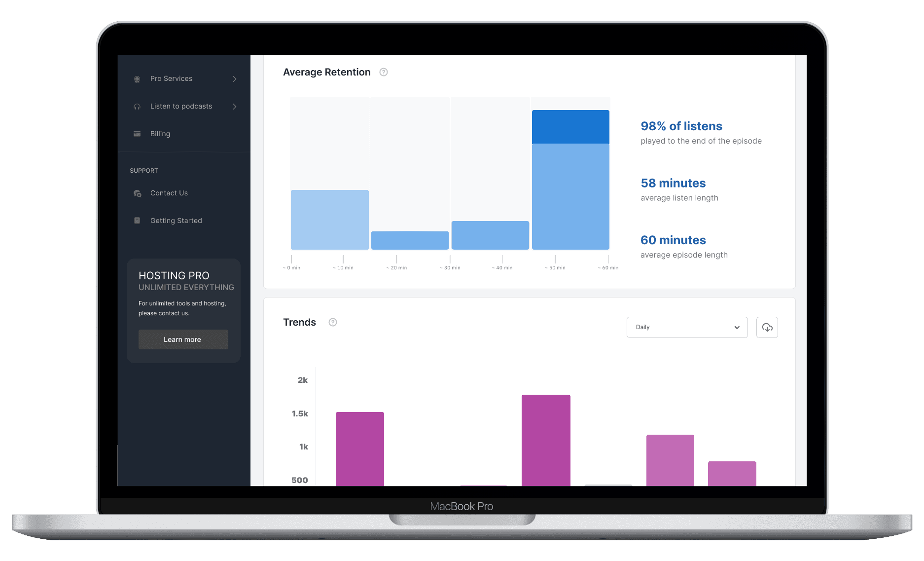
After
Intuitive layout with dynamic filtering options.
Visualized data trends through line graphs, bar charts, and pie charts.
Improved map-based geographical insights.
Fully interactive stats dashboard.
Charts for "Trending by Day" and "Trending by Month"
The Solution
Key Enhancements
Modernized UI: Redesigned the statistics interface to provide a cleaner, more visually engaging layout.
Enhanced Data Navigation: Added filters for custom date ranges, daily and monthly trends, and client breakdowns.
Interactive Visuals: Incorporated charts and graphs for better insights into listener trends.
Geographical Insights: Created maps and lists for audience locations, segmented by country, state, and city.